#327: Visualise the Graph in LangGraph
The more complex our control flow in our LangGraph application, the harder it is to understand what is going on. Luckily for us, we have multiple ways to visualise our graphs. Let us find out how we can do that.
The example application
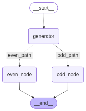
We reuse our branching example from last week's post, which looked like this:
Generate a PNG with Mermaid
The simplest way I found is to use Mermaid.js to create PNG files. We do not need to install any additional packages and can visualise our graph with this code snipped that we insert after line 61:
This gives us a PNG file with the visualisation you can find in the post from last week:
Install Grandalf
For most other visualisations, we need to install Grandalf first:
After a successful installation, we can proceed and try the other visualisation approaches.
Generate Mermaid.js instructions
If we want to get the raw definition for Mermaid.js, we can use Grandalf and add this code to our application:
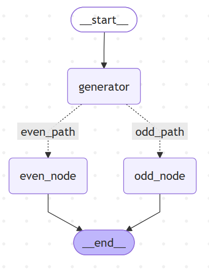
This gives us the instructions for Mermaid.js:
---
config:
flowchart:
curve: linear
---
graph TD;
__start__([<p>__start__</p>]):::first
generator(generator)
even_node(even_node)
odd_node(odd_node)
__end__([<p>__end__</p>]):::last
__start__ --> generator;
generator -. even_path .-> even_node;
generator -. odd_path .-> odd_node;
even_node --> __end__;
odd_node --> __end__;
classDef default fill:#f2f0ff,line-height:1.2
classDef first fill-opacity:0
classDef last fill:#bfb6fc
We can take this output and go to Mermaid.ai/live and create our visualisation:
Generate ASCII
With Grandalf in place, we can use this method to render our graph to ASCII:
This gives us this representation of our graph:
            +-----------+
            | __start__ |
            +-----------+
                  *
                  *
                  *
            +-----------+
            | generator |
            +-----------+
           ...         ...
          .               .
        ..                 ..
+-----------+           +----------+
| even_node |           | odd_node |
+-----------+           +----------+
           ***         ***
              *       *
               **   **
             +---------+
             | __end__ |
             +---------+
Jupyter Notebook and Mermaid PNG
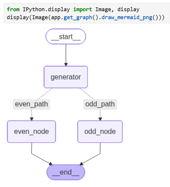
When we run our application inside a Jupyter Notebook, we can create a cell to render the Mermaid.js PNG with this content:
When we run the cell, it renders our graph:
Jupyter Notebook and Mermaid instructions
If we want to render the Mermaid.js instructions, we first need to install this package:
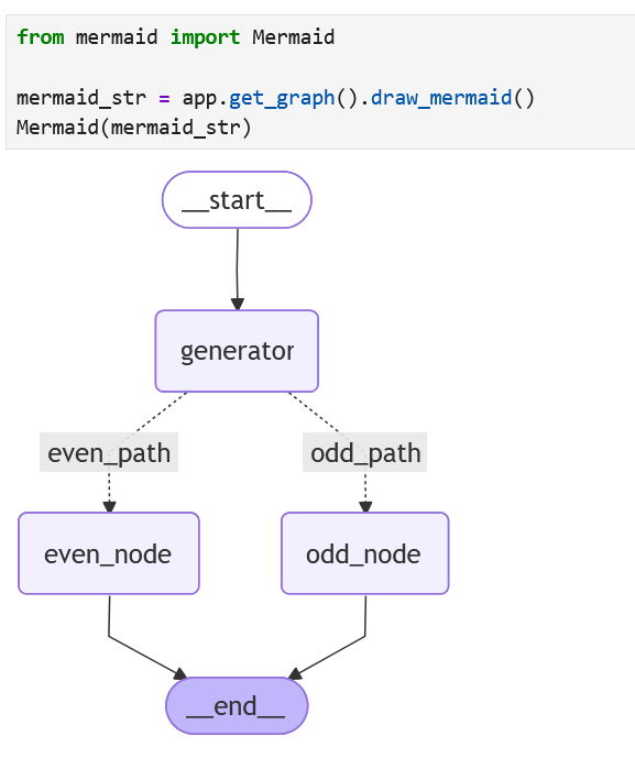
This allows us then to create a cell with this code:
If we run the cell, it takes a lot longer to render but we end up with the same visualisation:
Next
With these different approaches to visualise our graphs we should be able to find something that suits our needs. It is much simpler to spot an error in our graph when we have a visualisation to work with. Next week we continue our journey with LangGraph and build our own tools.