#317: Working With Stock Marked Data
Now that we know how to use yfinance to get data from the stock market, it is time to do some analysis with it. In this post we compare Apple, Microsoft, Nvidia, Google, and Amazon to give us an idea what we can do with the data.
Needed packages
Before we dive into the code, we must make sure that we have these packages installed:
Compare KPIs of multiple stocks
We get a plethora of data from yfinance. The first challenge we have is to pick the key performance indicators (KPI) we want to use to compare the companies. For that we best use an iterative approach and start with a few values and then extend our list as we get a better understanding.
The second challenge is to turn numbers like 4502247178240 into a more readable $4.50T. We can solve this problem with different formatting helpers for ratios, currencies and percentages.
A simple way to handle the KPI changes and the multiple formatters is by using a dictionary, where each key is a friendly name and the value is a tuple containing the yfinance field and its formatter. That way we can extend KPIs when we need additional data and define how we want to format the numbers.
By looping through the selected stocks and iterating over our KPI dictionary, we can fetch the data, filter it to the indicators we care about, and store everything in a Pandas DataFrame:
If we run our script, we get a table like this one:
                         AAPL     MSFT     NVDA     AMZN    GOOGL
Market Cap             $3.67T   $3.46T   $4.57T   $2.56T   $3.97T
Forward P/E             27.11    24.91    24.49    30.43    29.17
PEG Ratio                   —        —        —        —        —
Price-to-Sales           8.81    11.79    24.42     3.70    10.30
Revenue Growth (YoY)    7.9 %   18.4 %   62.5 %   13.4 %   15.9 %
EPS Growth (YoY)       91.2 %   12.7 %   66.7 %   36.4 %   35.3 %
Gross Margin           46.9 %   68.8 %   70.0 %   50.0 %   59.2 %
Operating Margin       31.6 %   48.9 %   63.2 %   11.1 %   30.5 %
Free Cash Flow        $78.86B  $53.33B  $53.28B  $26.08B  $48.00B
Debt-to-Equity         152.41    33.15     9.10    43.41    11.42
Current Ratio            0.89     1.40     4.47     1.01     1.75
Beta                     1.09     1.07     2.31     1.38     1.09
This should help us to compare the different companies. If we need additional data, we add an entry in the dictionary. If we want to check for different stocks, we need to find their ticker symbol and add it to our list. Feel free to customise it.
Compare the performance
Another helpful way to compare different stocks is to see how they performed relatively to each other. For that we fetch the historic prices for a list of stocks through the batch functionality of yfinance.
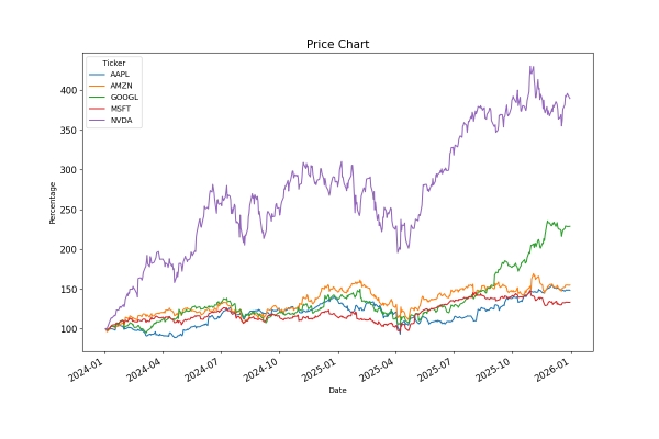
To make the data comparable, we calculate the relative closing price for each day compared to the first day's value (close_prices.iloc[0]). This gives us a normalised DataFrame that reflects the daily changes that we hand to Matplotlib to get a visualisation:
When we run the script, we get this plot for our stocks in 2025:

Since we normalise to the first day of our data set, we can have massive changes in the plots when we change the date range. If we set the start date to the first trading day in 2024, we get a different picture:
Next
With those two examples we can get an idea on how to use Python to compare stocks. We can use all the data we get from yfinance and build our own analytics on top of it. Next week we test some trading strategies by running the algorithm against historical data.