#316: Visualise Stock Market Data With mplfinance
Last week we used yfinance to fetch stock market data. In this post we explore our options to visualise them to get a better understanding of how the stock price moved around. For this task we use the library mplfinance. The library is a bit dated, but it gives us all the well-known visualisations without much effort at our end.
Installation
Mplfinance is built on top of Matplotlib and offers us utilities to visualise financial data. We can install the library with this command:
Fetch the data
As described in the last post, we can use this code snipped to fetch the last 3 months of prices for the Nvidia stock with yfinance:
OHLC chart
OHLC stands for open, high, low, close of a trading interval and is the default plot in mplfinance:
This creates a plot like this for our 3-month period with an indicator for each trading day:

Candlestick chart
Candlestick charts are commonly used in analytics, displaying one indicator per trading interval. The candle's body represents the open/close range; wicks show high and low prices. A green or white body means the stock closed higher, while red or black indicates it closed lower. We can create this type of plot with the type='candle' parameter:

Line plot
If we prefer a minimalistic line plot, we can use the parameter type='line':
This gives us a single line along the close prices of each trading interval:

Renko chart
A Renko chart highlights trends by showing only meaningful price movements. Each block (called a brick) is drawn only when the price moves by a predefined amount, what ignores small fluctuations of prices. We can create the plot with the type='renko' parameter:
This gives us a good overview of the trend:

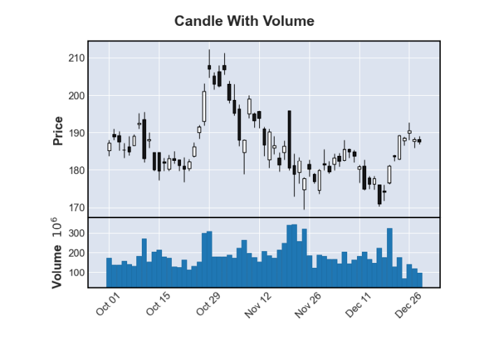
Include the volume
Another important indicator is the volume of shares traded. We can add this information with the volume=True parameter to any of the plots:
This creates a candlestick plot and adds the volume of traded stocks below:
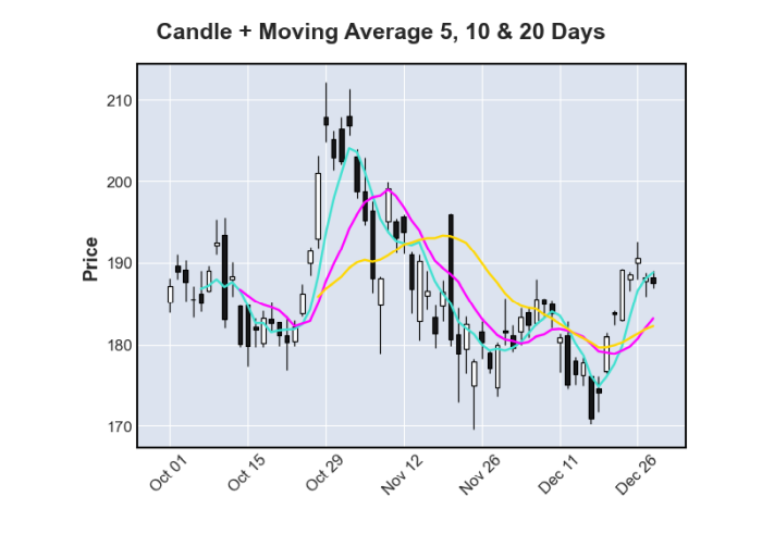
Moving averages
Moving averages help us to see the trend more clearly by averaging past prices over time. We can set whatever values we want and pass them to our plot with the mav=() parameter:
This gives us an average line for each interval we specified on top of our plot:
Next
To identify outliers and errors in stock market data, we can use a library like mplfinance to quickly generate visualisations such as candlestick or Renko charts. These visualisations make it easy to spot major trends or shifts in trading volume with minimal coding effort. Next week we play around with the stock market data and compare a few stocks.