#189: Visualize Text With a Word Cloud
Creating graphs with numerical and categorical data is something we got comfortable with over the last months. But how can we visualize a text to spot the common words and get a hint of the topic? Let us figure out how we can tackle such a challenge.
Install wordcloud
Word_cloud works on top of NumPy, Pillow, and Matplotlib and allows us to create word clouds. We can install it with this command:
Create a word cloud
For our first steps we turn the Zen of Python into a word cloud. We need our text and import Matplotlib and wordcloud to transform the text into a plot:
This creates us a word cloud like this one:

Customise the word cloud
We can set various options for our word cloud. The most useful one in my opinion is the size, that we can influence with the parameters width and height. With max_words we can reduce or increase the number of words that are part of the word cloud:
This gives us a word cloud for the 100 most used words with a white background and blueish words:

Use a shape for the word cloud
We can use an image with a high contrast and turn that into a shape for our word cloud. For this post we use this triangle:

The heavy lifting for the mask is done by NumPy and we can use the created filter as the mask parameter in our word cloud:
This creates us a word cloud in the shape of a triangle:

The created graphic might not be that spectacular, but we could find more elaborate shapes and better fitting texts to create small works of art, like the parrot on the GitHub page.
Works on the command line
If you just want a word cloud without writing any code, you can use the wordcloud_cli.exe and use the parameters to customize your image:
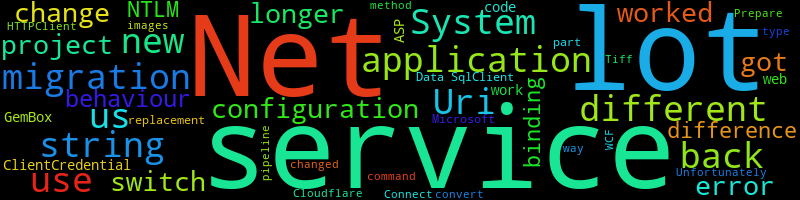
This takes the text of my post 10 Unpleasant Surprises When Migrating From .Net 4.8 to .Net 6 and turns it into this image:
Next
With this foray into text visualisation, we have found an interesting approach to capture the essence of a written text. If this post caught your interest, I can highly recommend to explore the Gallery of Examples in the documentation.
Next week we continue with a more traditional approach to data visualization and add an interactive touch to our plots.