#179: Explore Your Data With Pandas
So far, I printed the Pandas data frame in Jupyter to see what data is in it. That works for small data frames but is rather useless for large ones. Let us find better ways to explore our data in Pandas.
Our data set
For this post we use the diamonds data set from the ggplot2 project. This is a data visualisation project for R and comes with some interesting data sets.
We can read the diamonds.csv file into a data frame with this code:
What columns are in our data frame?
With the info() method we get a first idea about our data frame:
We see that our data frame has 53940 entries and 10 columns.
Show the shape of our data
If we only care about the numbers for the columns and rows, we can use the shape property:
This tells us also that there are 53940 rows in 10 columns.
Show the beginning of our data
With the head() method we get the first 5 rows of our data frame:

Show the end of our data
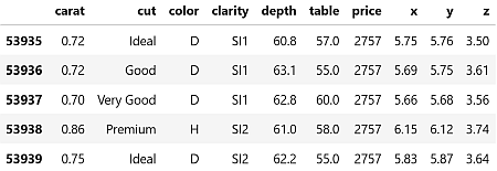
With the tail() method we get the last 5 rows of our data frame:
Get a random sample of our data
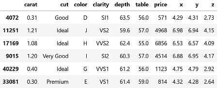
We can use the sample() method to get a single random row of our data frame. If we prefer a larger sample, we can specify how many rows we want:
Show the distribution of the data
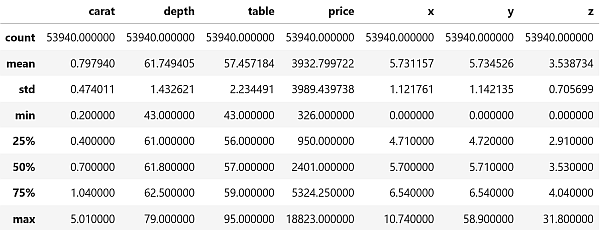
For the numerical columns we can use the describe() method to learn about the statistical details of their values (like min, max, mean, etc.):
Count the values in a column
For the categorical columns, the describe() method is not that useful. We get much better results with the value_counts() method for the categorical columns we are interested in:
Next
With the methods described in this post we can get a first understanding about our data set. As you notice when your run the commands on your machine, the results come in nearly instantly. That speed of results is a great help if you played around in your Jupyter notebook and are not sure if you have the right data in your df variable.
Next week we look how Seaborn can give us a visual aide to understand connections between the different attributes of our data.